
Start simple:
Explain difference between Internet and Web:
Example analogy:
The Internet is like electricity — it powers everything.
The Web is one of the devices that uses that electricity.
Basic components:

Use a simple diagram or analogy:
Explain terms:

Start with examples: Daraz, Amazon, Alibaba, Foodpanda.
Explain simply:
Benefits:
Risks:
Ask: “How is a website made?”
Frontend vs Backend:
| Part | Description | Examples |
|---|---|---|
| Frontend | What user sees | HTML, CSS, JavaScript |
| Backend | What happens behind the scenes | PHP, ASP.NET, Python, Node.js |
| Database | Where data is stored | MySQL, SQL Server, MongoDB |
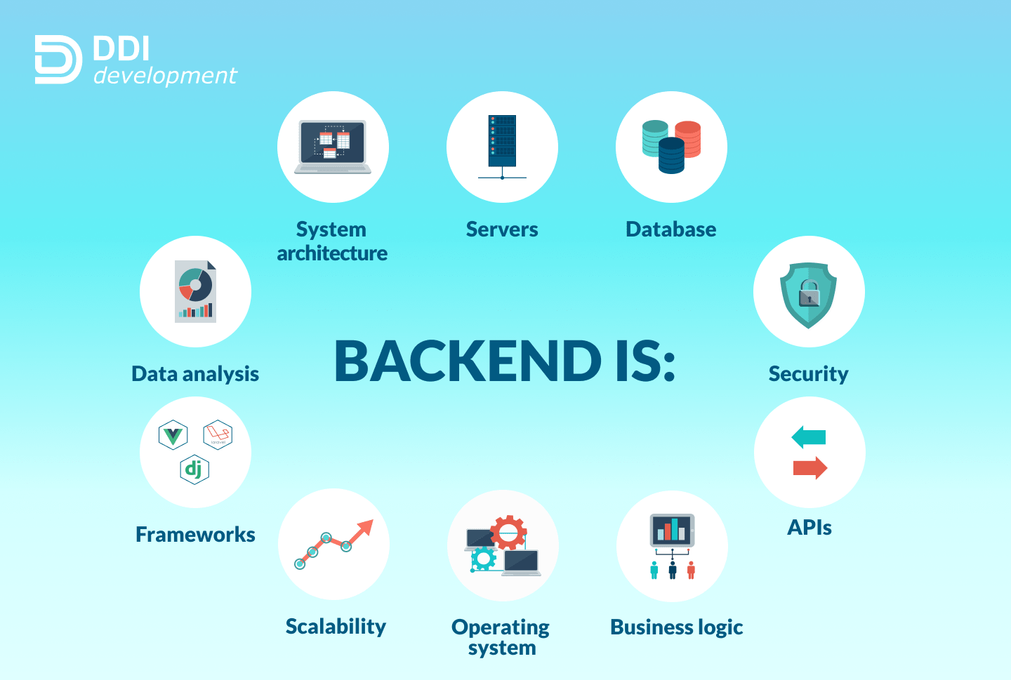
When a user opens a website, they see only the frontend — the visible part (HTML, CSS, images, buttons).
But behind the scenes, something much smarter is happening — that’s the backend.
Examples of what backend code does:
Different programming languages can be used to build the backend — depending on developer choice or project needs.
| Language / Framework | Common Uses | Key Strength |
|---|---|---|
| PHP | WordPress, dynamic websites | Simple, widely supported on cheap servers |
| ASP.NET (by Microsoft) | Enterprise, web apps | Secure, powerful for large systems |
| Python | Web apps, data-based sites | Easy to read, strong in AI and data handling |
| Node.js | Real-time apps (chat, live updates) | Fast, uses JavaScript on server too |
The backend makes websites interactive, dynamic, and connected.
When you log in to Facebook, check your balance online, or add an item to a cart — backend code is doing the work.
Without a backend:
⚡ In Short: Frontend shows → Backend thinks and processes → Database remembers.
JavaScript started as a frontend language — it runs directly inside your browser.
When you open a website:
Examples:
Later, developers realized — “If JavaScript can handle the frontend so well, why not use it on the server too?” That’s where Node.js came in.
JavaScript is the only language that can work on both frontend and backend, which is a big reason for its popularity.
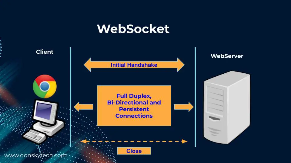
Normally, websites use the HTTP protocol — the browser sends a request, the server sends a response, then the connection closes.
If you want new data, the browser must keep asking repeatedly (“Do you have anything new now?”). This is called polling, and it’s slow and wastes bandwidth.
WebSockets create a constant, two-way connection between browser and server.
Once connected, both can send messages instantly — no need to keep asking.
It’s perfect for live updates, such as:
Analogy: Instead of repeatedly knocking on someone’s door (HTTP), you open a phone line (WebSocket) and stay connected — both sides can talk anytime.
SignalR is a framework by Microsoft (used in ASP.NET) that makes it easy to use WebSockets — plus it automatically switches to other methods if WebSockets aren’t available.
SignalR provides:
Developers use SignalR for: Live chat, instant notifications, real-time dashboards, online gaming interactions.
| Term | Purpose | Example |
|---|---|---|
| HTTP | One-time request & response | Loading a page |
| WebSocket | Continuous two-way connection | Chat, live data |
| SignalR | .NET framework using WebSockets easily | Live notifications in ASP.NET apps |
WebSockets give speed — SignalR gives simplicity.
Together, they make the web feel alive and instant.
Stages:
Tools / Technologies to mention briefly:
The <div> tag in HTML is a block-level container element used to group and organize content.
It doesn’t have any visual effect by itself but is very useful for layout, styling, and scripting purposes.
Key Points:
Example:
<div class="container">
  <h2>Welcome to My Website</h2>
  <p>This is a section of content inside a div.</p>
</div>
Notes:
You can add id or class attributes for styling or scripting:
<div id="main-content" class="section"></div>
Often used with CSS and JavaScript to control layout and behavior.
👉 In short, <div> is like an invisible box used to structure, style, and control parts of a webpage.
HTML5 introduced semantic elements that make code more meaningful and SEO-friendly.
| Tag | Purpose / Description | Example Use |
|---|---|---|
| <header> | Represents the top section of a page or an article — usually contains logos, navigation, or titles. | html <header><h1>My Website</h1></header> |
| <nav> | Defines a navigation bar or set of links. | html <nav><a href="#">Home</a> |
| <main> | Specifies the main content area of the webpage (unique section). | html <main><p>Main page content here.</p></main> |
| <section> | Groups related content together — like chapters or topic sections. | html <section><h2>Services</h2><p>We offer...</p></section> |
| <article> | Used for independent, self-contained content like blog posts or news articles. | html <article><h2>Blog Title</h2><p>Post text...</p></article> |
| <aside> | For side content like a sidebar, tips, ads, or related links. | html <aside><h3>Quick Links</h3></aside> |
| <footer> | Defines the bottom section of a page or article — usually contains contact info or copyright. | html <footer>© 2025 My Website</footer> |
| <figure> and <figcaption> | Used for images, diagrams, or charts with captions. | html <figure><img src="pic.jpg"><figcaption>Image Caption</figcaption></figure> |
Key Difference
| Tag Type | Meaning | Example |
|---|---|---|
| <div> | Generic, no meaning — purely structural | <div class="header"></div> |
| Semantic tags | Meaningful and descriptive — improves readability, SEO, and accessibility | <header></header> |
<p id="main" class="text">Apple</p>
<style>
.text { color: blue; }
#main { color: red; }
</style>
.text { color: blue; } is a class selector (specificity = 0,0,1,0).
#main { color: red; } is an ID selector (specificity = 0,1,0,0).
Higher specificity wins, so the #main rule overrides .text and the paragraph text becomes red.
CSS gives each type of selector a weight:
| Selector Type | Example | Specificity Weight |
|---|---|---|
| Inline style | <p style="color:red"> | 1000 |
| ID selector | #main | 100 |
| Class / attribute / pseudo-class | .text, [type=submit], :hover | 10 |
| Tag selector | p, h1 | 1 |
| Universal selector | * | 0 |
<p id="main" class="text">Apple</p>

<style>
  .text { color: blue; } /* class → 10 */
  #main { color: red; }  /* ID → 100 */
</style>

.text → 10 points
#main → 100 points
100 > 10, so red wins.
If you write:
p { color: green; }
.text { color: blue; }
#main { color: red; }
CSS must decide which one to apply.
Specificity gives a clear rule: More specific selector (more points) overrides less specific ones.
p { color: red; }         /* 1 */
p.text { color: blue; }   /* 1 + 10 = 11 */
#main { color: green; }   /* 100 */

Winner → green
.text { color: red !important; } /* 10 but with !important */
#main { color: blue; }            /* 100 */

Winner → red
Because !important beats normal rules.
Specificity = a scoring system that decides which CSS selector has higher priority.
The selector with higher specificity overrides the others.
The word “flex” in CSS means flexible — it comes from Flexible Box Layout, often just called Flexbox.
Flexbox is a modern layout system in CSS designed to easily arrange elements in rows or columns, even when their sizes are dynamic or unknown.
In older CSS, developers used:
Flexbox solves all these layout problems elegantly.
Flexbox (short for Flexible Box Layout) is a one-dimensional layout system in CSS.
“One-dimensional” means it controls either rows or columns at a time (not both).
It helps you align, order, and space elements — without using float, table, or positioning tricks.
Think of it like a smart container that automatically arranges its child elements to fit neatly, even if their sizes change.
You turn on Flexbox by applying:
display: flex;
to a parent element (the container).
Example:
<div class="container">
  <div>Box 1</div>
  <div>Box 2</div>
  <div>Box 3</div>
</div>

.container {
  display: flex;
}
Now .container becomes a Flex Container, and all direct children become Flex Items.
| Term | Meaning |
|---|---|
| Flex Container | The parent element where you apply display: flex; |
| Flex Items | The child elements inside the container that will be arranged automatically |
Flexbox works along two axes:
+------------------------------------------+
| cross axis (up-down)                     |
|                                          |
| --> main axis (left-right)               |
| [item][item][item]                       |
+------------------------------------------+
| Axis | Controlled by | Description |
|---|---|---|
| Main Axis | flex-direction | The direction items flow (row or column) |
| Cross Axis | align-items | The perpendicular direction |
| Property | What It Does | Common Values |
|---|---|---|
| display | Turns Flexbox on | flex, inline-flex |
| flex-direction | Sets the direction of the items | row, column |
| flex-wrap | Allows items to wrap to new line | nowrap, wrap |
| justify-content | Aligns items along the main axis | flex-start, center, space-between |
| align-items | Aligns items along the cross axis | flex-start, center, flex-end, stretch |
| align-content | Aligns multiple rows | space-between, center |
You apply these to the children (items) inside the flex container.
| Property | Meaning |
|---|---|
| flex-grow | How much an item should grow if there’s extra space |
| flex-shrink | How much an item should shrink if space is tight |
| flex-basis | The initial size of the item before flexing |
| flex | Shorthand for all three above |
| align-self | Aligns one specific item differently from others |
| order | Changes the display order of items (without changing HTML order) |
<div class="container">
  <div class="box1">A</div>
  <div class="box2">B</div>
  <div class="box3">C</div>
</div>

.container {
  display: flex; /* Activate Flexbox */
  justify-content: space-around; /* Space around boxes horizontally */
  align-items: center; /* Center vertically */
  height: 200px;
  background: #eee;
}

.container div {
  background: #4CAF50;
  color: white;
  padding: 20px;
  width: 100px;
  text-align: center;
}

Result:
Boxes A, B, and C are arranged in a row,
Evenly spaced,
Vertically centered inside the container.
<body>
  <header>Header</header>
  <main>Main Content</main>
  <footer>Footer</footer>
</body>

html, body {
  height: 100%;
  margin: 0;
}

body {
  display: flex;
  flex-direction: column;
}

main {
  flex: 1; /* Take all remaining space */
  background: #f9f9f9;
}

header, footer {
  background: #333;
  color: white;
  text-align: center;
  padding: 10px;
}

Result:
Footer stays at the bottom — even if the page is empty.
| Problem | How Flexbox Helps |
|---|---|
| Hard to center elements | justify-content + align-items make it easy |
| Responsive design needed | Items automatically resize and wrap |
| Uneven item sizes | Flexbox evenly distributes space |
| Complex alignment | Fewer lines of CSS than float/grid |
| Feature | Flexbox | Grid |
|---|---|---|
| Layout Type | One-dimensional (row or column) | Two-dimensional (rows and columns) |
| Best for | Navigation bars, buttons, cards, layouts in a line | Whole page layouts, dashboards |
| Key CSS Property | display: flex; | display: grid; |
Meaning: Turns an element into a Flex Container, and all its direct child elements become Flex Items.
What it does:
Example:
.container {
  display: flex;
}

Now all elements inside .container will automatically align next to each other in a row by default.
Meaning: Defines how flex items are arranged — in a row (horizontal) or a column (vertical).
Values:
| Value | Layout Direction |
|---|---|
| row | Left → Right (default) |
| column | Top → Bottom |
| row-reverse | Right → Left |
| column-reverse | Bottom → Top |
Example:
.container {
  display: flex;
  flex-direction: column;
}

Now the items will stack vertically, like:
Header
Content
Footer

Use case: Perfect for webpage layouts — header → content → footer.
Meaning: flex is shorthand for flex: <grow> <shrink> <basis>;
In this case:
flex: 1;
Means:
flex-grow: 1;
flex-shrink: 1;
flex-basis: 0;
What it does: Tells the flex item to grow and take up available remaining space in the container.
Example:
.content {
  flex: 1;
}

If you have:
<header>Header</header>
<div class="content">Main Content</div>
<footer>Footer</footer>

and the container is:
body {
  display: flex;
  flex-direction: column;
}

Then .content will expand to fill all vertical space between the header and footer — keeping the footer at the bottom.

This is how sticky footers are usually created with Flexbox.